Digital Disbursement
Transamerica was going through a shift in how it helped its clients. The old way — customers submitting paper forms, processors reviewing them manually — was outdated, error-prone, and slow. This project replaced that workflow with a digital experience built for both the customer and the processor.
Role
Sr. UX Designer (Consultant)
Client
Transamerica · via Synechron
Platform
Web application
Domain
Retirement & Insurance
My Role
Embedded design, from discovery to delivery
I joined as a Senior UX Designer consultant from Synechron. Transamerica's product manager and business stakeholders had already spent considerable time planning and shaping the vision — including a strong pitch deck and existing documentation. My job was to translate that vision into a usable product, working embedded with the in-house team through discovery, design, and handoff.

About the project
A workflow that hurt customers and the business
Customers submitted paper forms that processors reviewed by hand, cross-referencing multiple internal systems. The cost showed up on both sides — customers waited days for status, and processors juggled tools to verify a single request.
Business strategy
Go completely paperless
The ideal end state — but to get there, Transamerica needed to build a foundational Disbursement Application that simplifies and automates the processing of paper disbursement requests.
Discovery
The existing process
Before designing anything new, we mapped what existed today — tracing how a request moved from a customer's hands, through the call center, into the processing teams, and back out as a resolution.
Take aways
70% of the requests are mailed or faxed to the processing teams. As a result, this increases the time for the review process as well as increase risk of human error.
The over reliance on the call center as the main orchestrator of submitting requests increases costs to the business.
Due to high volume of paper documents, all of the submission need to be scanned for record keeping and the review process. The process is slow and inefficient.
New Vision
A journey-map workshop to anchor the rebuild
Together with stakeholders, we spent a few days in a workshop mapping the current user journey. The exercise revealed connections between numerous other departments, the project's true scale, and pain points buried inside the existing process.
The vision: digitize the customer document uploading process, remove manual processing effort, and let the system flag where a request is in good order (IGO) for submission. This reduces resolution time, removes error-prone hand-offs, and frees processors for the cases that actually need human judgement.
Persona
The requests' processor
Besides customers, processors are the other critical persona in the disbursement process. Customer satisfaction relies heavily on how quickly and accurately a processor can review and progress a request — so designing for them, not just around them, became central to the project.
Opportunities
How might we serve processors better?
HMW 01
Improve the document upload process
HMW 02
Improve communication between persona roles
HMW 03
Improve the quality-control process for every form field
HMW 04
Manage workflows between processors collaborating on the same case
Concept Exploration
The processor's queue
Today, processors review customer requests from a queue shared across the entire staff. Cherry-picking is prevented by routing, but that strips away context when a processor already knows a specific customer. We explored two directions to balance fairness with context.
Requirements
→A CTA to start a new request
→Access to a personal and a shared queue
→Metrics on handling time
→Metrics on number of requests left to complete for the day
Design Option A
Choose by request category
The processor picks a category they want to work on and pulls the next available request inside it. Preserves some specialization, but reintroduces the cherry-picking pattern the operation wanted to avoid.


Design Option B
Trigger from a shared list
The processor pulls from a single shared list — the system hands out the next case based on priority and skill match. Keeps the workload fair and removes cherry-picking, while still letting processors see what's coming
Dashboard Design
Processor's dashboard
The dashboard splits into two complementary views — the processor's personal workload and the broader team queue. Together they answer "what should I work on right now?" and "what does the operation look like today?"

Personal queue — default state

Personal queue — default state
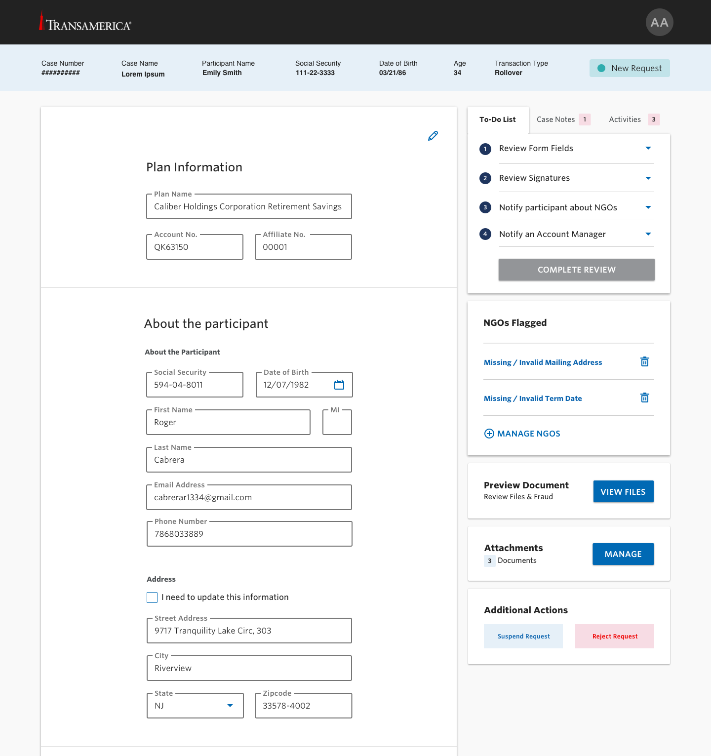
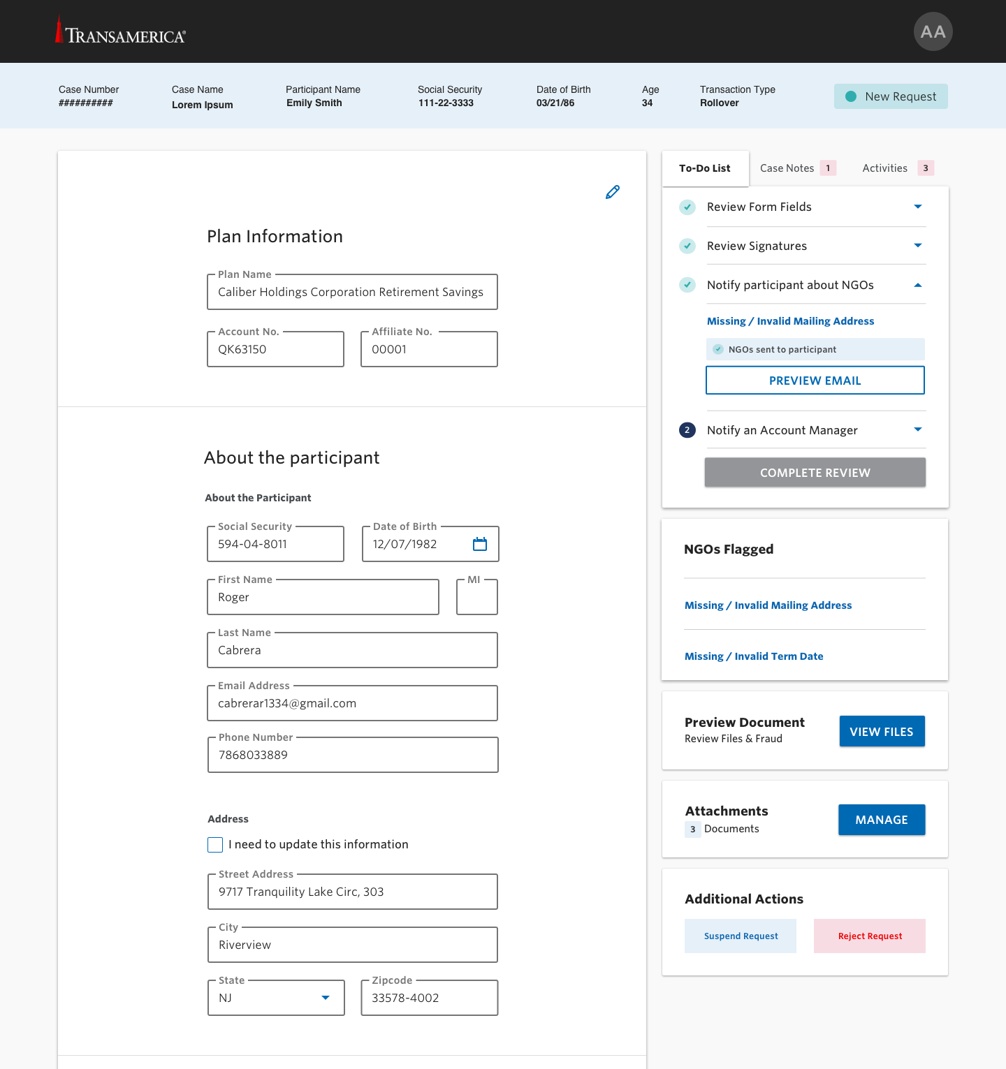
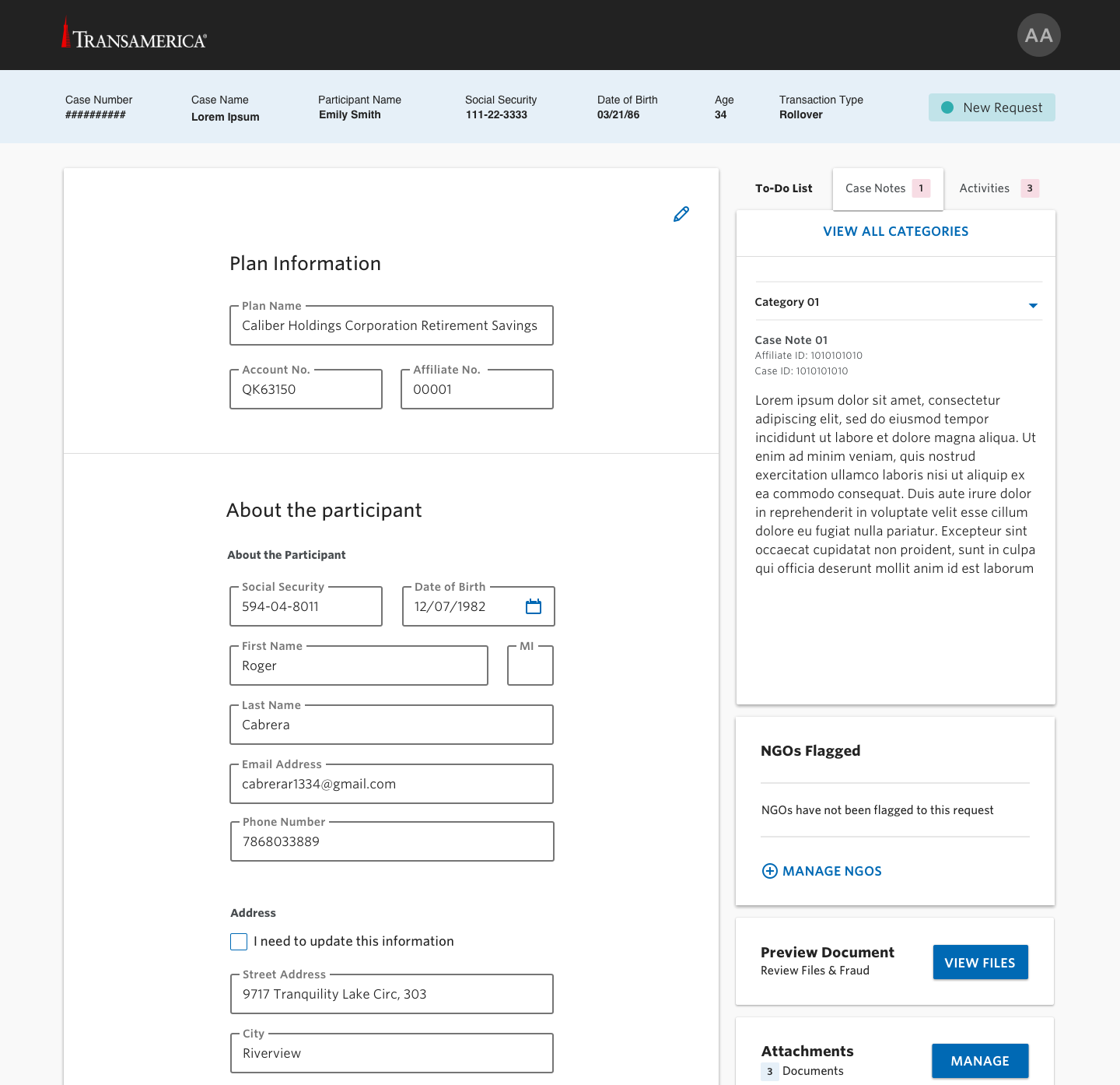
Review Experience
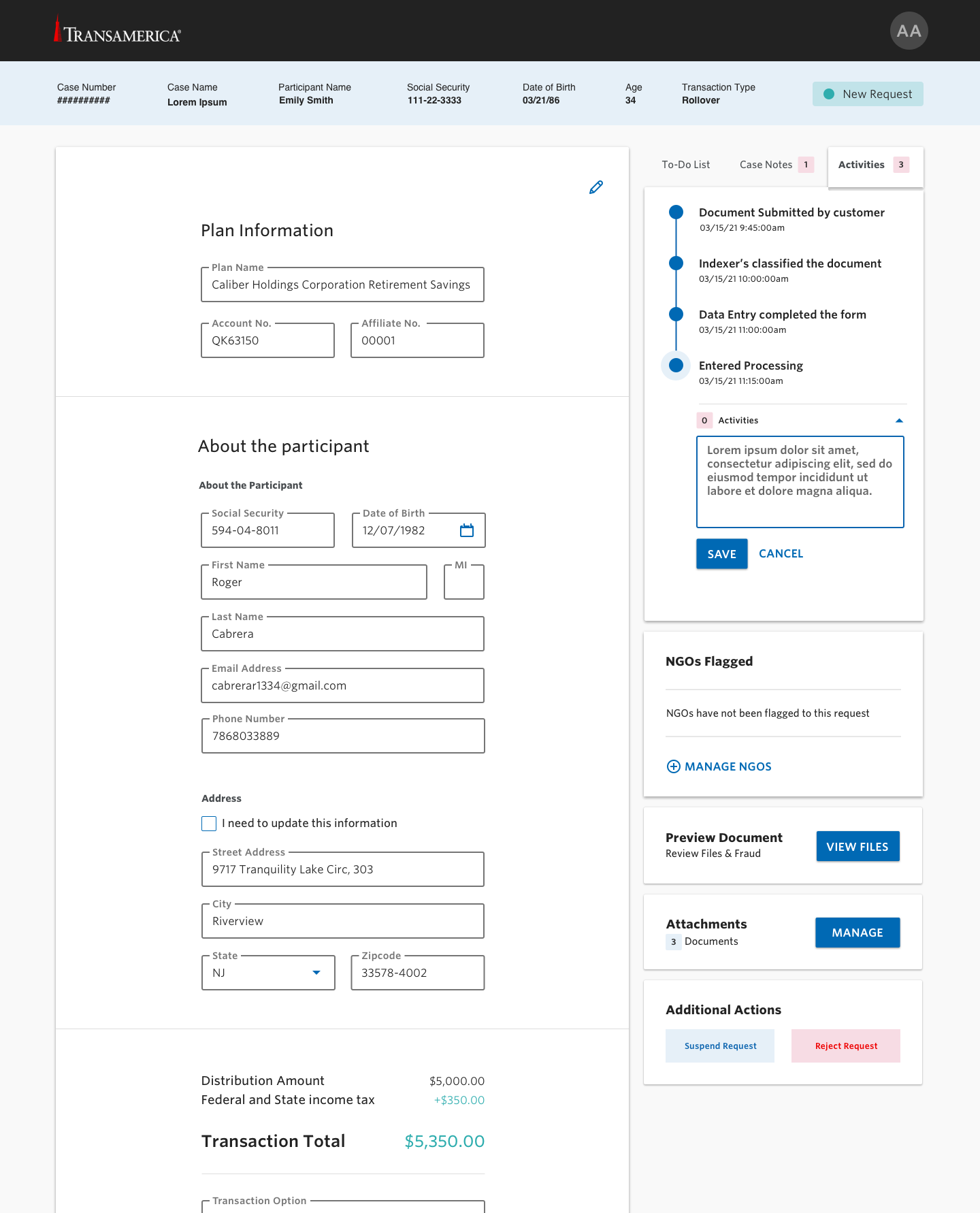
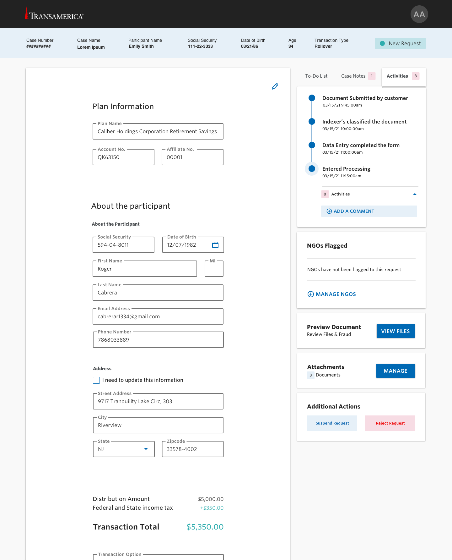
The processor's review
We held daily workshops with the client, users, and developers, iterating on processor screens in real time. Everyone in the meeting had access to MIRO — turning a normally lengthy review cycle into a continuous, collaborative loop.
01
OCR-driven form fields
Displaying OCR'd documentation directly as form fields meant the processor never had to translate paper into data manually. The screen became the source of truth, with the original document available for reference.
02
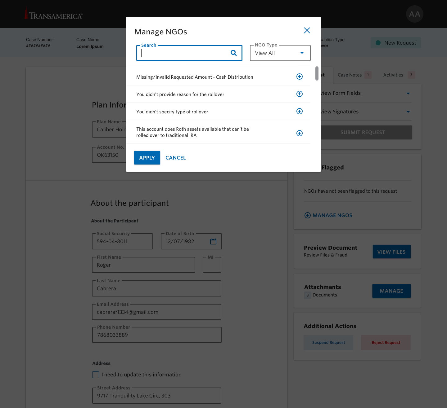
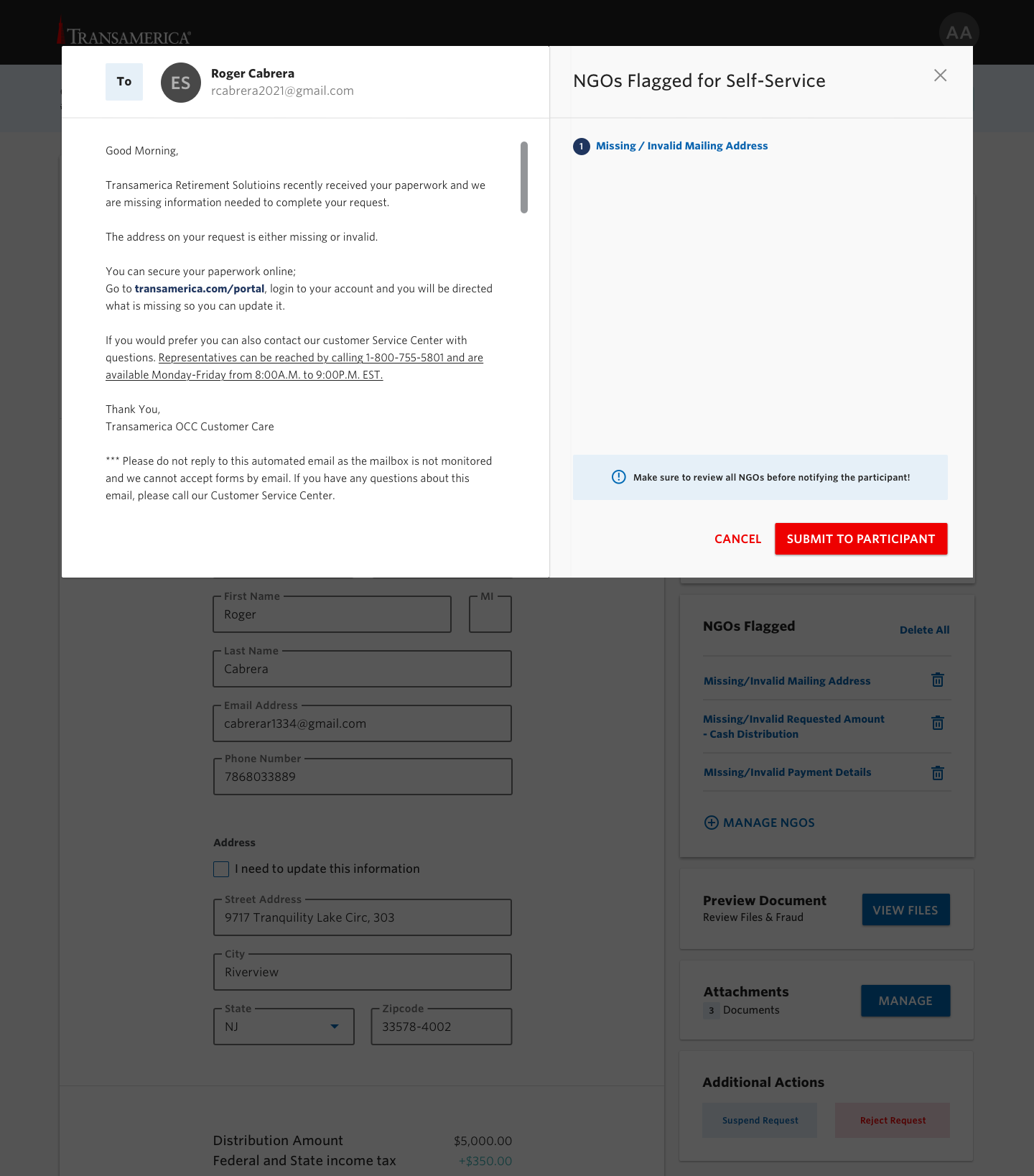
Distinguishing NGO sources
NGOs (Not in Good Order) could come from a misalignment with business rules or from human error. We had to make that distinction visible to the processor — the right correction depends on the cause.
03
Action over information
Every review screen surfaces the next required action without burying the supporting context. Processors stay focused on moving cases forward, with detail available on demand.

Concept exploration · processor review
Final Visual
Processing a request in context
Processor’s review


Review Flow
Step by step, end to end
From first review through completion — each screen handles a specific moment in the processor's flow.

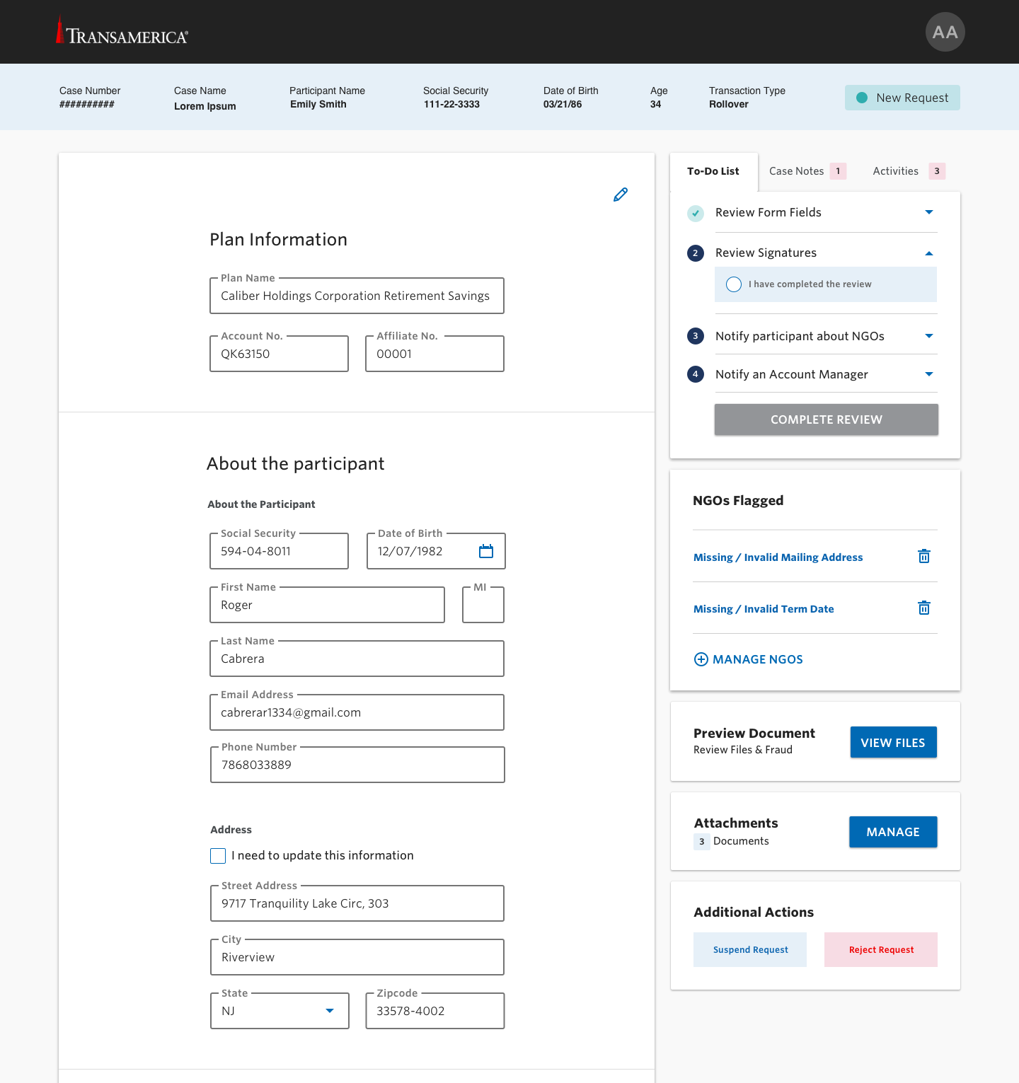


Processor activities
Status and side-panel states across the activity flow — what the processor sees as they move through a case.
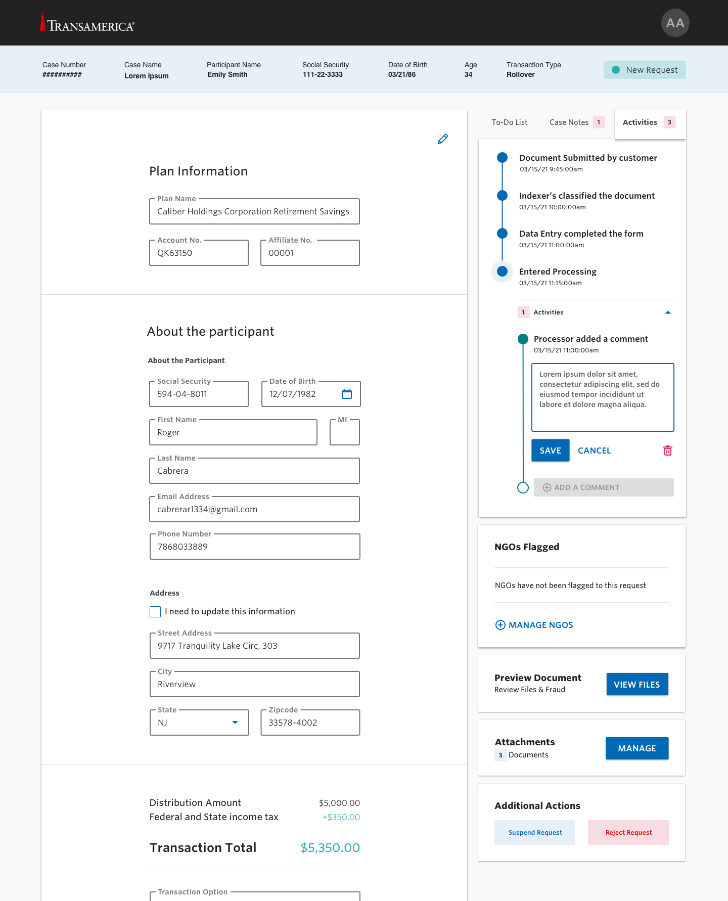
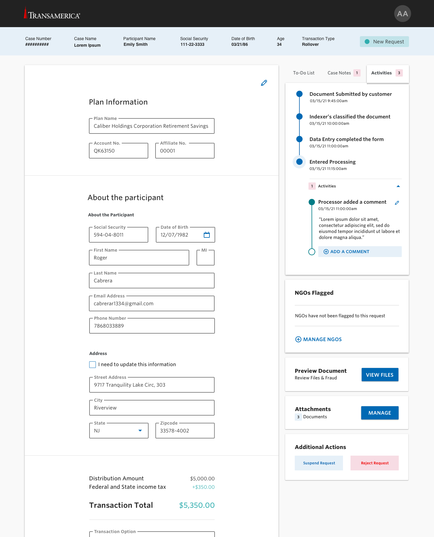
NGO Handling
Managing NGOs in context
When a request falls out of "good order," the processor needs to see why, what to attach, and what to communicate — without leaving the case.
Project Outcomes
Results & Impact
Replacing paper-and-handoff with a digital workflow gave Transamerica a disbursement experience that respects both the customer's time and the processor's attention.
Paperless
Replaced the mail/fax intake that drove 70% of incoming requests
Faster
Cases resolved without the paper-to-review wait baked into the legacy workflow
Clearer
NGO causes distinguished at a glance — business rule vs. human error
Collaborative
Daily MIRO workshops kept design, users, and engineering on the same page
Learnings
What this project taught me
When a workflow spans two audiences, you can't design well for one without designing for the other. Every customer-side improvement here was also a processor-side improvement — validation upstream meant fewer rejections downstream; clearer status meant fewer inbound calls; structured intake meant fewer ambiguous cases to triage.
"Digital" alone isn't the win. Putting a paper form on a screen would have moved the same friction onto a keyboard. The real shift was rethinking the entire hand-off chain so that the digital experience could carry context the paper one never could.
Embedding design directly in daily workshops with users, developers, and stakeholders changed how we worked. Decisions that normally take weeks of async review happened live in MIRO, with the right people in the room — and the team came out the other side with a shared understanding of why each decision was made.