
COASST is an organization that's part of U.Washington's marine biology department. This group conducts research on the impact marine debris has on beaches along the west. Collecting valid data requires hiring licensed volunteers (mainly retired educated folks) identifying marine debris as well as dead birds. The study helps scientists learn about how much debris lands of the beaches, where it possibly came from and its impact on the environment.
The current process is very tedious. The 'data collector' inputs all of their findings on a chart with very specific fields. This information is inputted into the COASST website either by an intern or the the data collector themselves.
Then a COASST scientists goes onto the site and filters through the data and validates the information provided by the data collector.
Because the process is so tedious and important, the Data Entry site needs an improvement in its usability.
Data Entry site consisted of an outdated experience and usability.
To improve the UX, I had to come up with the solution using several steps.
1. Understand the current site. To improve the usability, my team and I had to understand who the main users are and map out the current user flow.
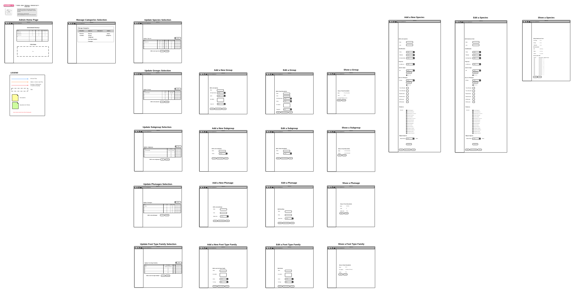
2. Recreate the existing site in a wire-flow to visualize the pages and steps involved at the same time.
3. Now seeing the big picture and the details, we began white boarding ideas on where certain pain-points exist, filter out unnecessary content and incorporate important content and features.


The sketch below are just a small example of finding away to improve the user flow for the 'Data Collectors' as well as incorporating a clearer UI.


Volunteer Wireflow
Crowdsoursing App

Administer - Survey Verification
Adding Photos to the Survey