Project Brief:
Our team was tasked to re-design ADHD&You with a new brand campaign focusing on Adults with ADHD.
Our Solution:
The UX team conducted interviews with the Medical staff with backgrounds in Psychology and Primary Care. We also gathered data on device and tool usage from studies done through 'Manhattan Research'.
Starting with the user
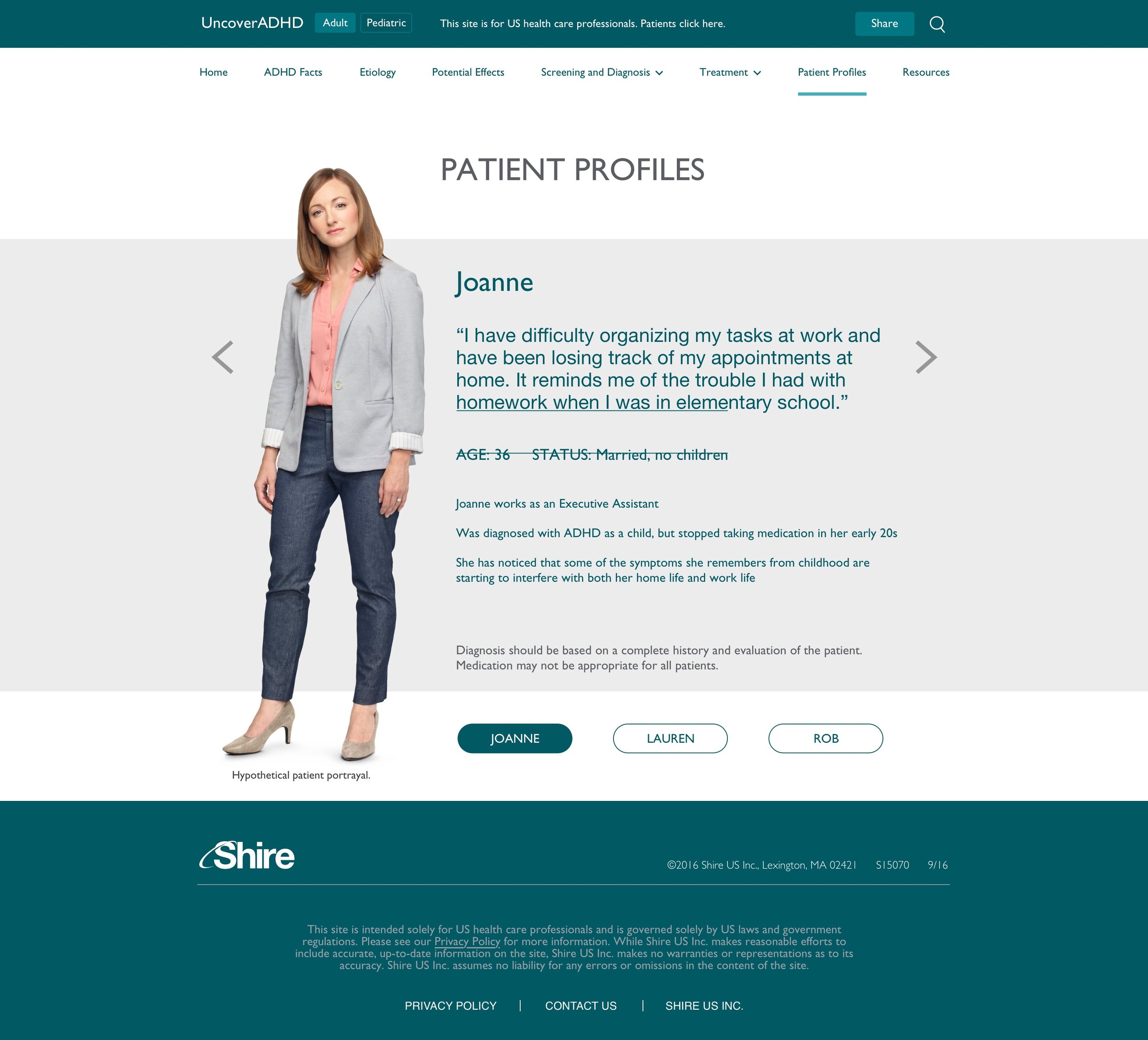
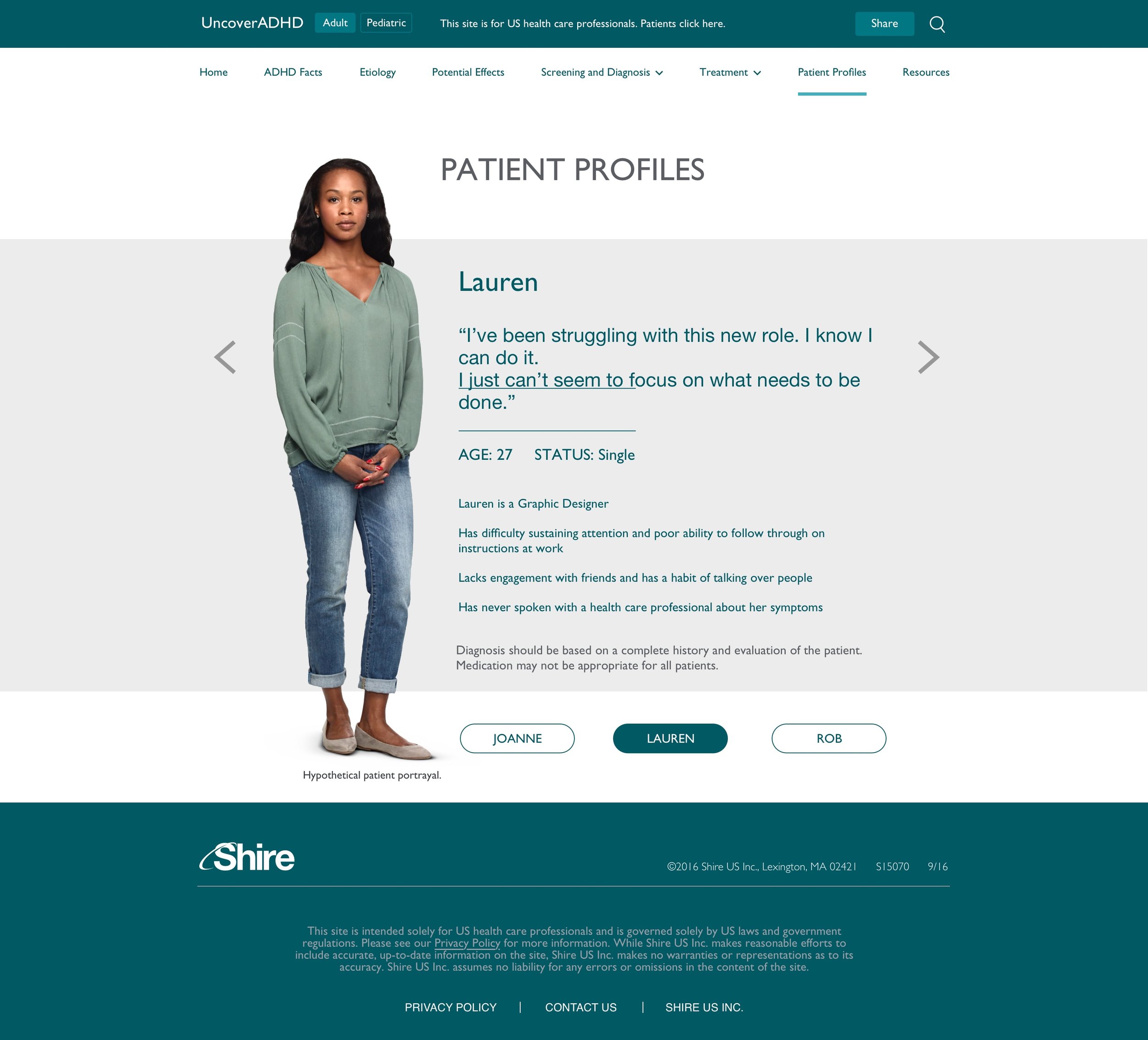
User Personas
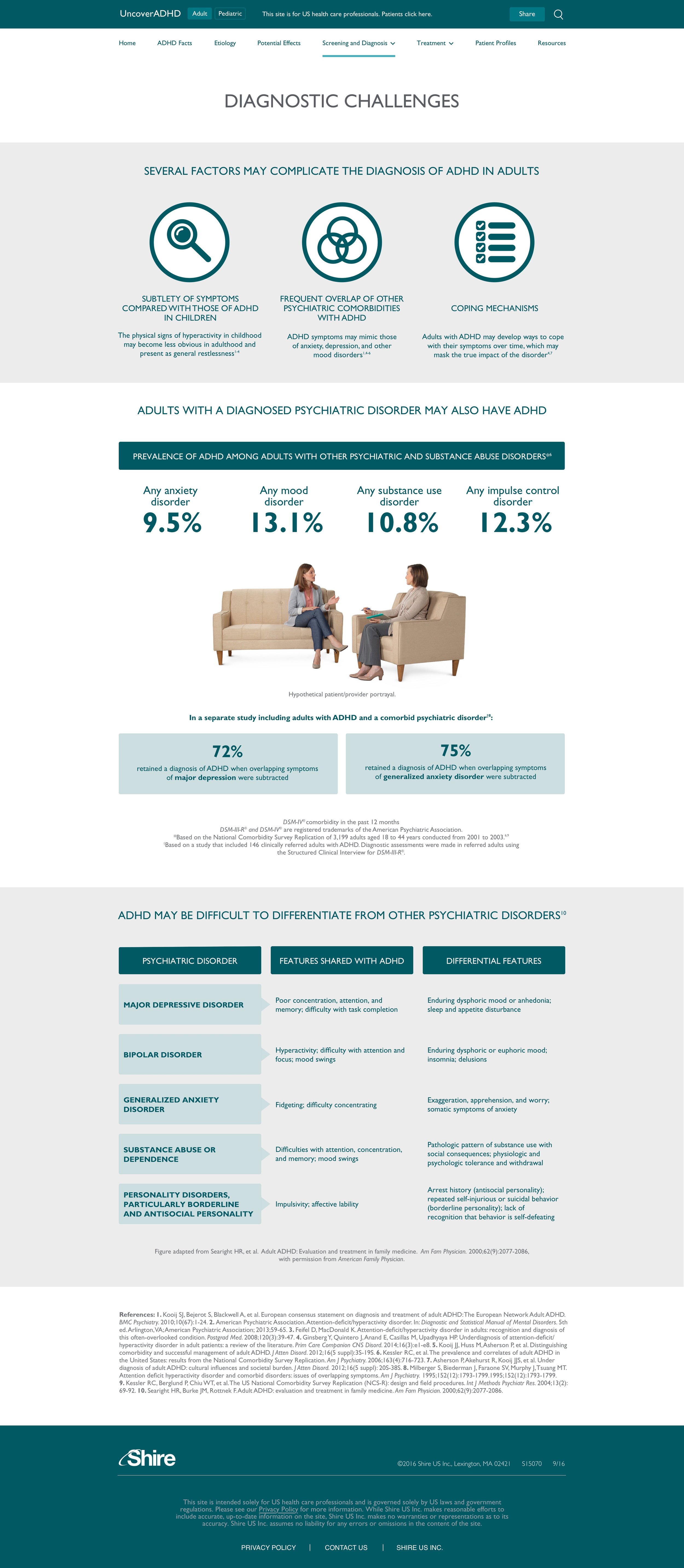
Insight 1: We learned quite a bit about Primary Care Physicians and Psychologists after meeting with our Medical staff. Diagnosing ADHD in adults is a challenge because the symptoms can overlap with other co-morbid conditions such as Anxiety and Depression.
Insight 2: Both Primary Care Physicians and Psychologists are the type of individuals that want to find relevant information quickly and easy to find. The current website is confusing because the relevant information is buried within landing pages and sub-navigation.
Insight 3: Primary Care Physicians typically do not trust information coming from a pharmaceutical company because they believe they are being sold to.
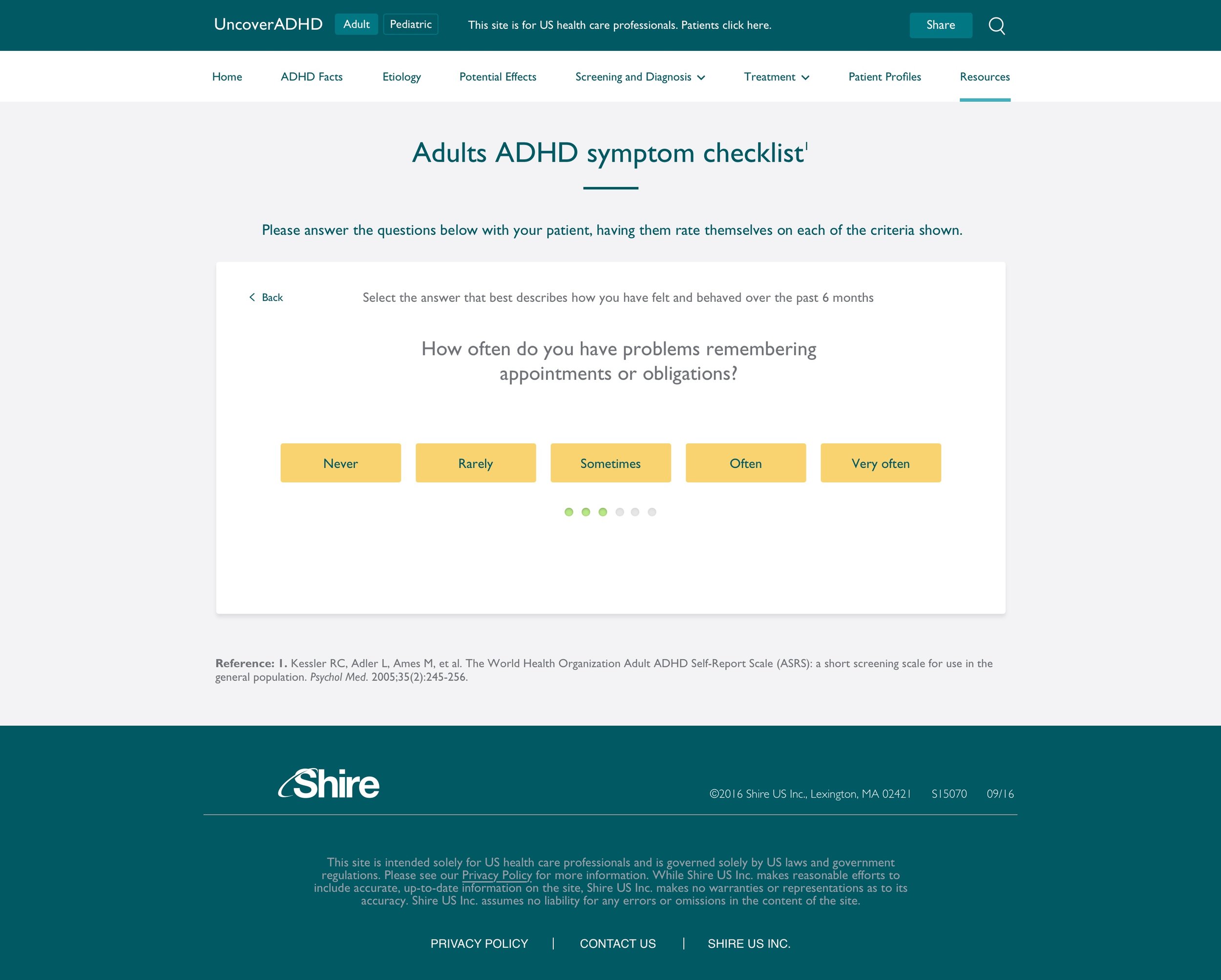
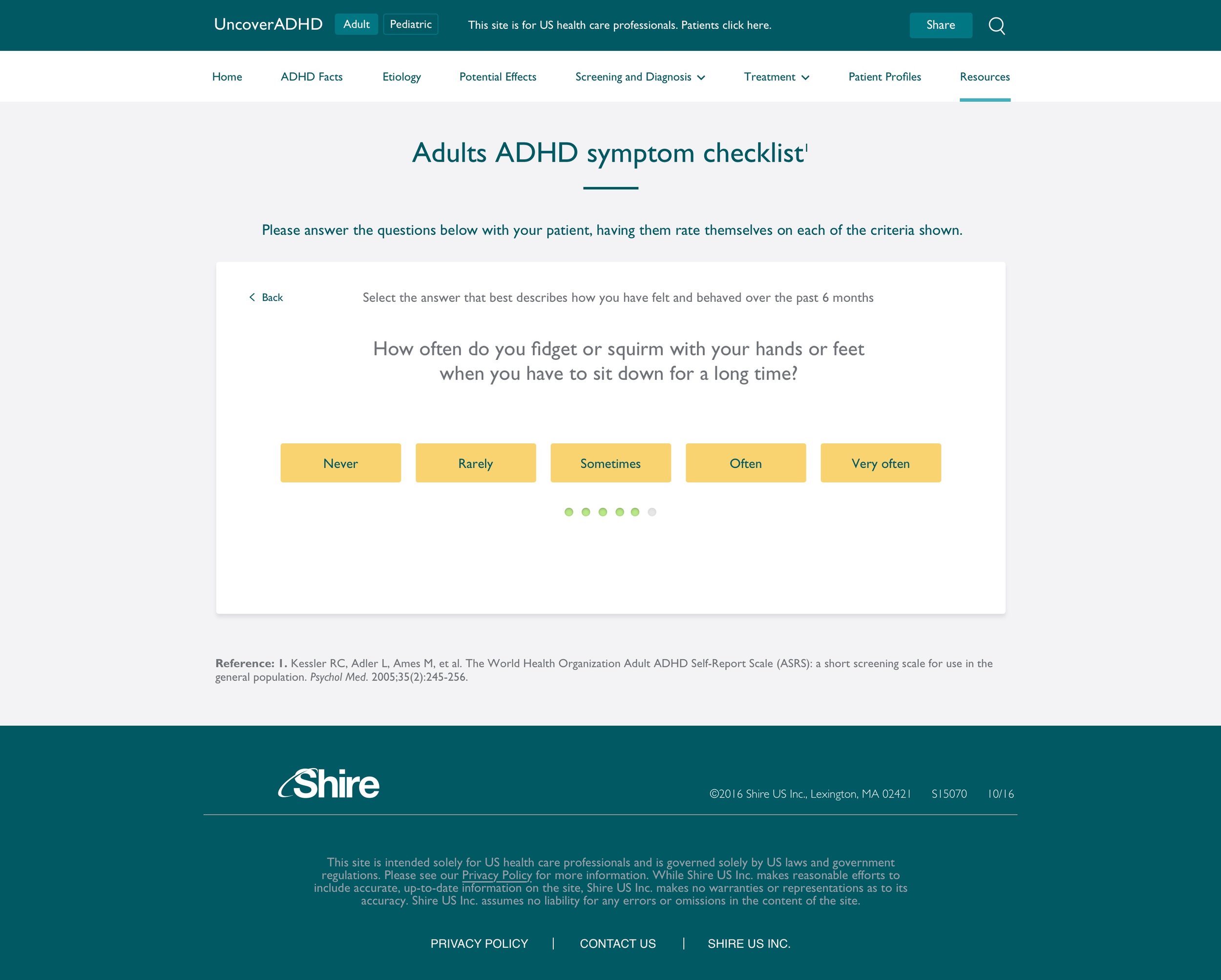
Information Architecture: Navigation
Creating the navigation was one major part of the success of this project. Knowing that the users want to find relevant information quickly, we had to create a nav that allowed discoverability but at the same time didn't clutter the website.


Based on our initial research we designed the navigation on the desktop as a Menu + Hamburger icon. This allowed us to have a thin header to place more emphasis on the content.
When the user clicks on the hamburger icon a mega menu / Chinese menu appears showing all the major section and the subsections. The client loved the simplicity of the design but they were confused about hamburger icon and the naming of the subsections under ADHD in Adults and ADHD in Children.
So we had to go back to the drawing board
We found this article from the NNG dating back to June 26 2016. The article mentioned that hidden navigation has performed significantly bad on desktop in terms of discoverability compared to a combo navigation or a full navigation. On mobile the hidden navigation was still preforming well because user were more accustomed to it.


Design Updates
There were two major IA decision that we as a team agreed upon that we should change.
We have to reduce the levels of navigation. Instead of dividing the nav between Adults and Children, we are thinking of creating a splitter page and then lead the user to either the adult section or the children section.
Once the user chooses a section, the navigation is made easier with clear topics and subsections.
Pros: This method is easier for the user to find what they are looking for.
Cons: Organic search
Redesign


Prototyping the navigation experience
My team and I are going to recommend two navigation options to the client.
Option A: is a standard nav with a sub-nav to single pages.
Option B: is also a standard nav but instead of a sub-nav, the user clicks on a more robust page but will then will either scroll down to different sections or user pagination to drop down to different sections in the page.
Desktop Design